The story
The film types filaro in Prompt Black, splits it in two, draws the scoop, then edits every letter with the mouse. Each move on screen is a real change between the font and the final logo.
Case studyMaraş ice cream, New York2026
01The brand
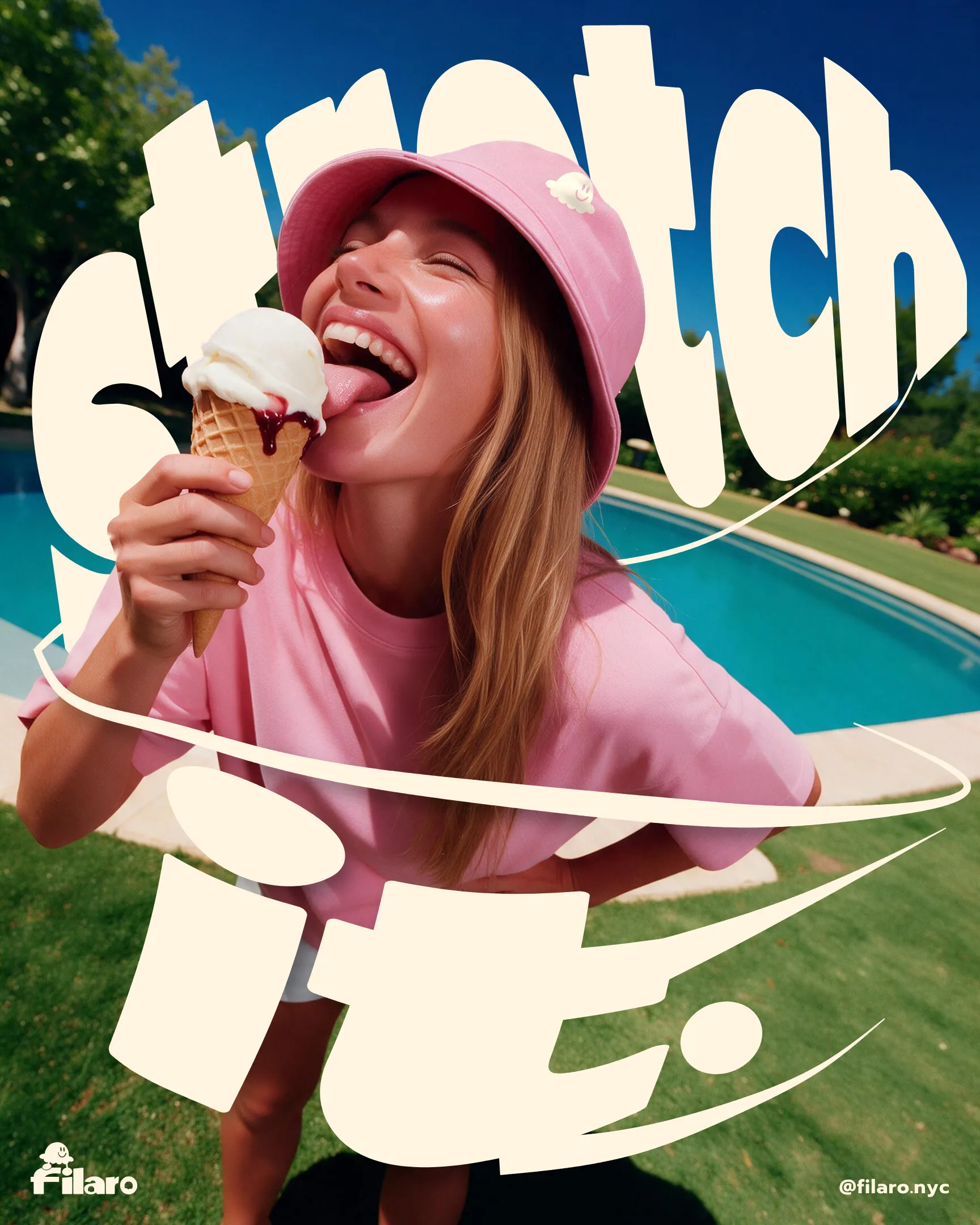
Filaro brings the stretchy Maraş recipe to New York: goat milk, salep and mastic, pulled by hand and sliced with a knife. Everything else about the brand starts from that one fact.
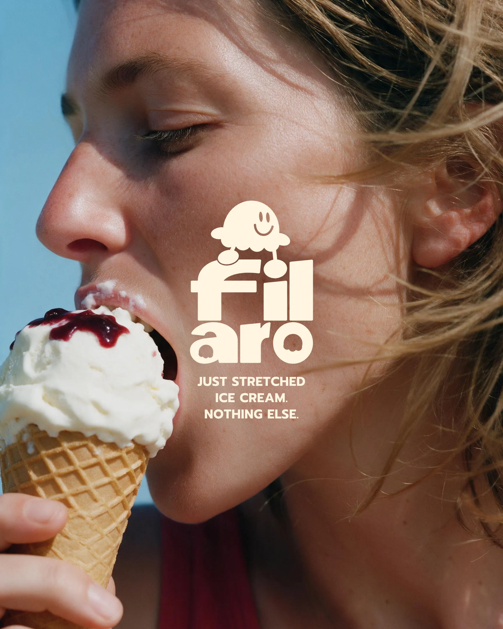
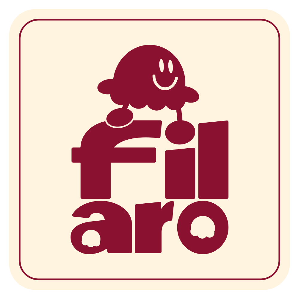
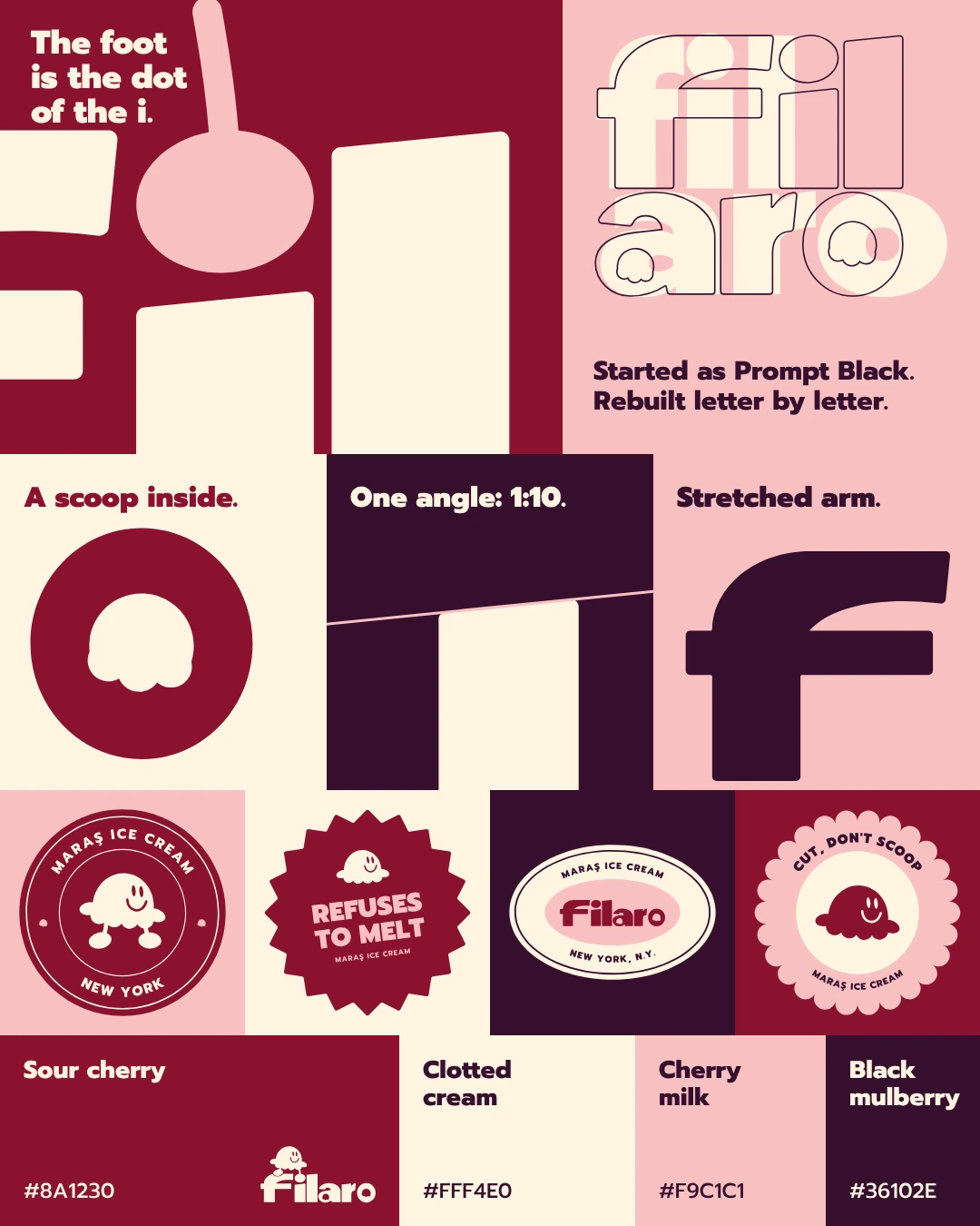
The logo is stretched and cut the same way. A small scoop sits on the word, and its foot is the dot of the i. Take the figure away and the name stops working.
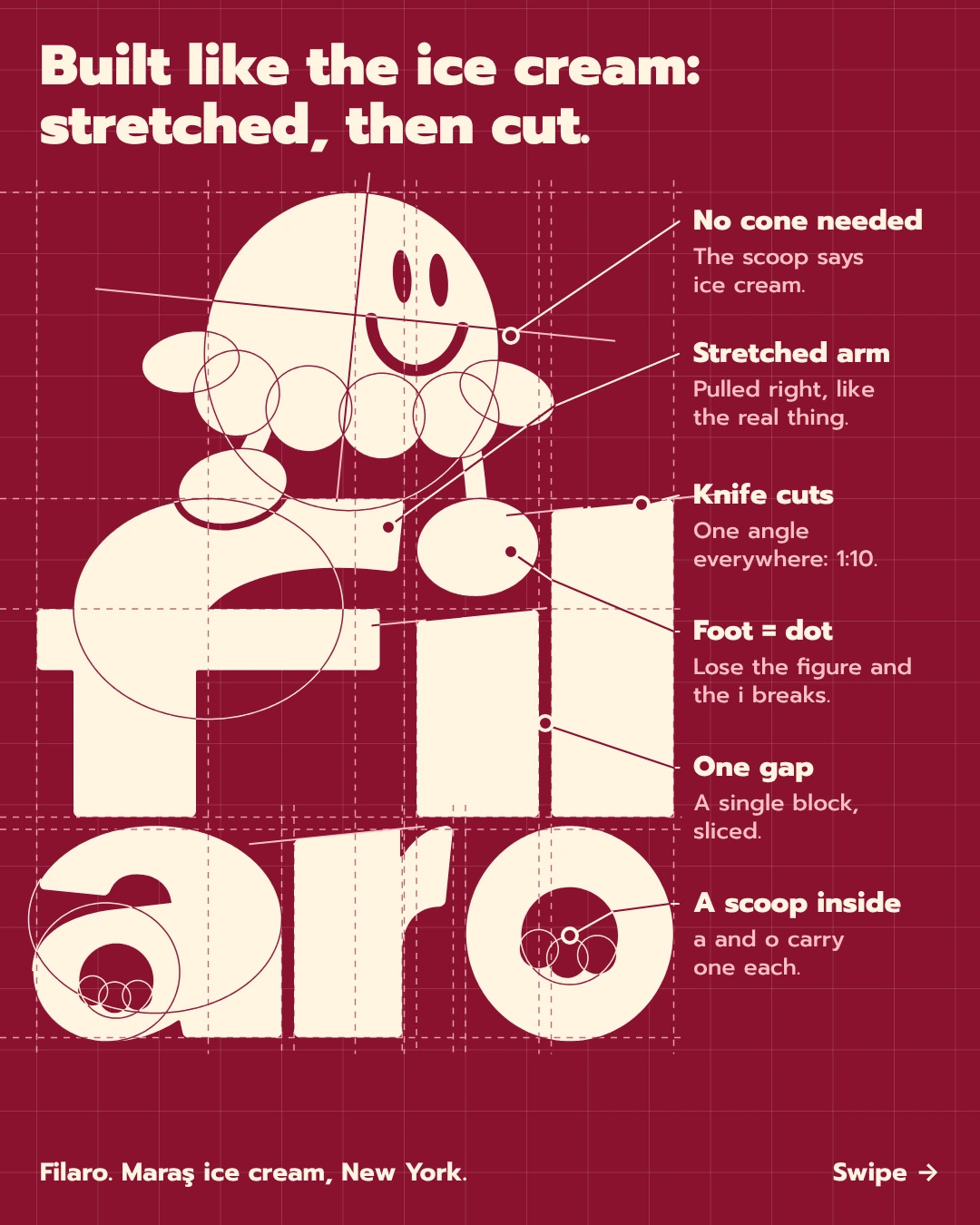
Built like the ice cream:
stretched, then cut.
02The mark
One module, 1u, is a tenth of the i's stem. The word block measures 52u by 44u, outer corners take a 0.5u radius. Lines change color where they cross the logo, so they stay readable on both surfaces. Open the one-page grid (PDF)
03Logo system
Film I · Logo film
The film types filaro in Prompt Black, splits it in two, draws the scoop, then edits every letter with the mouse. Each move on screen is a real change between the font and the final logo.
Vector animation, 4:5, 19 seconds. Open it full screen for the sound.
04Color
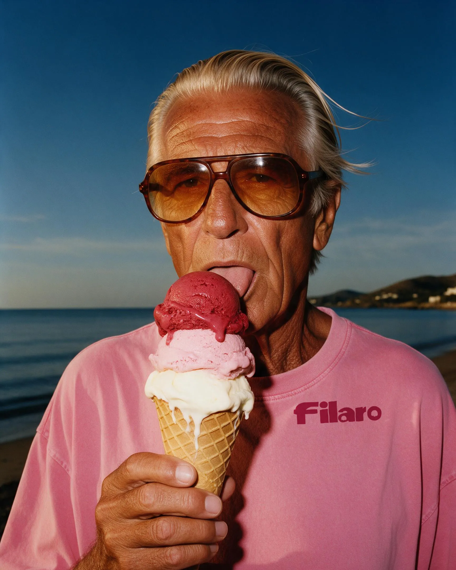
Sour cherry sauce over white ice cream. The logo is the ice cream, the ground is the sauce, and the pink is what happens where they meet. Black mulberry adds the depth. Tap a color to copy it.
One rule: black mulberry never carries text on sour cherry. The contrast is too low.
05Typography
Prompt Black was the closest font with a straight l and a round dot. Its letters were then redrawn: wider stems, a longer arm, knife cuts and a scoop inside a and o. Prompt stays on as the brand typeface for stickers, packaging and everything small.
06Badges

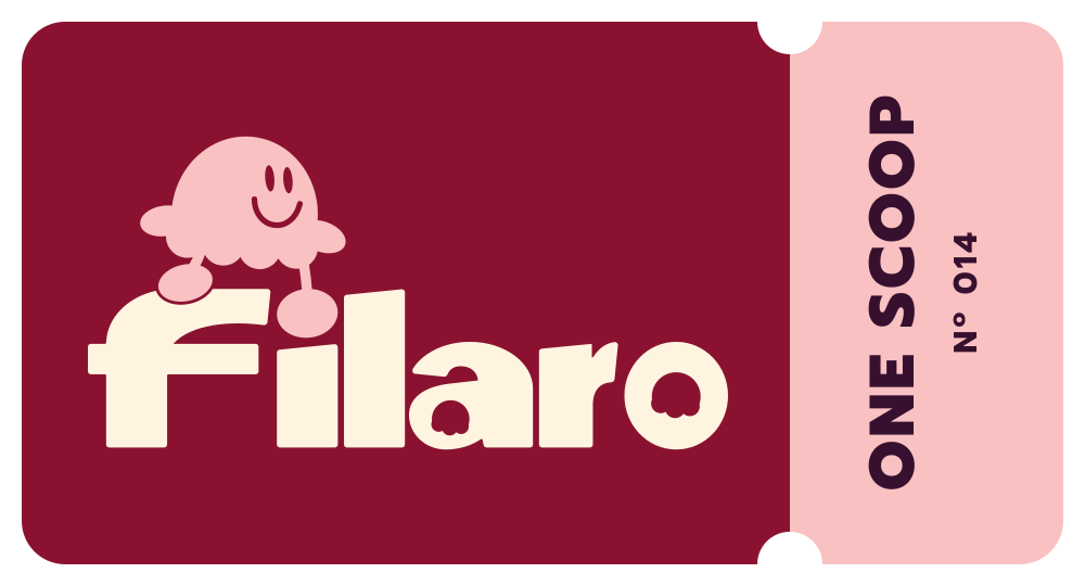

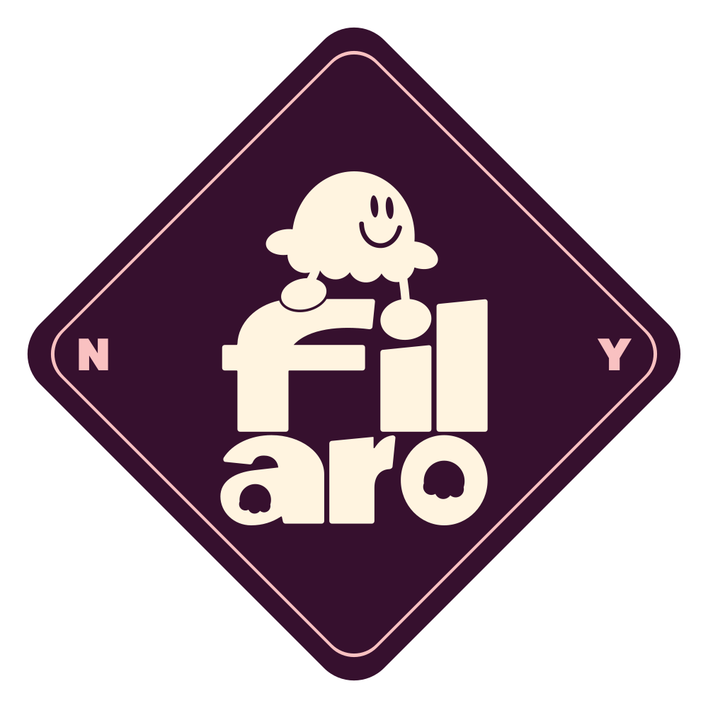

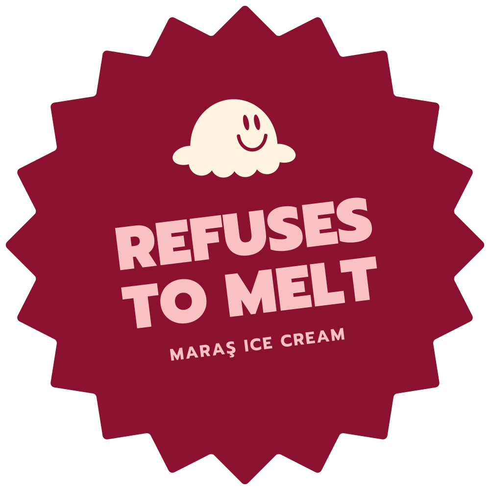
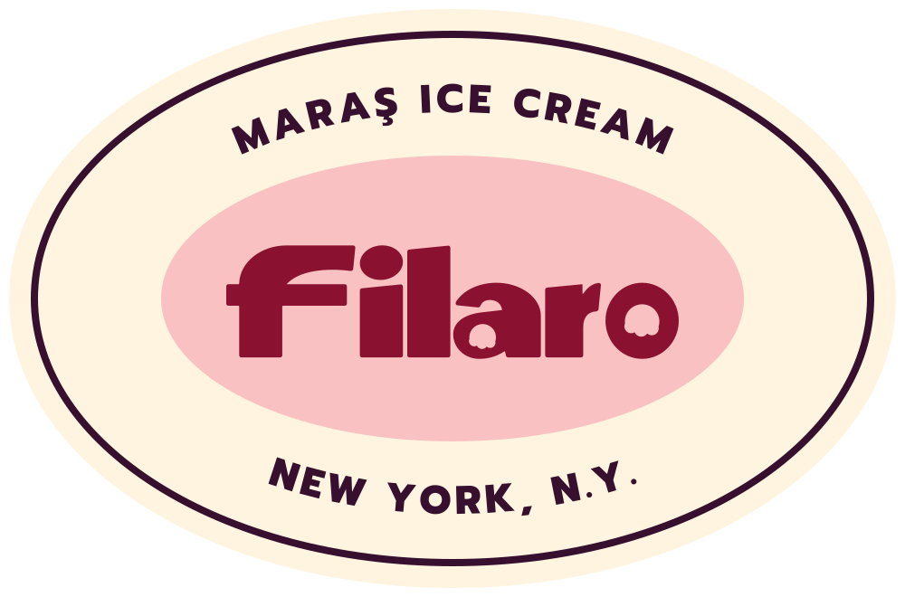
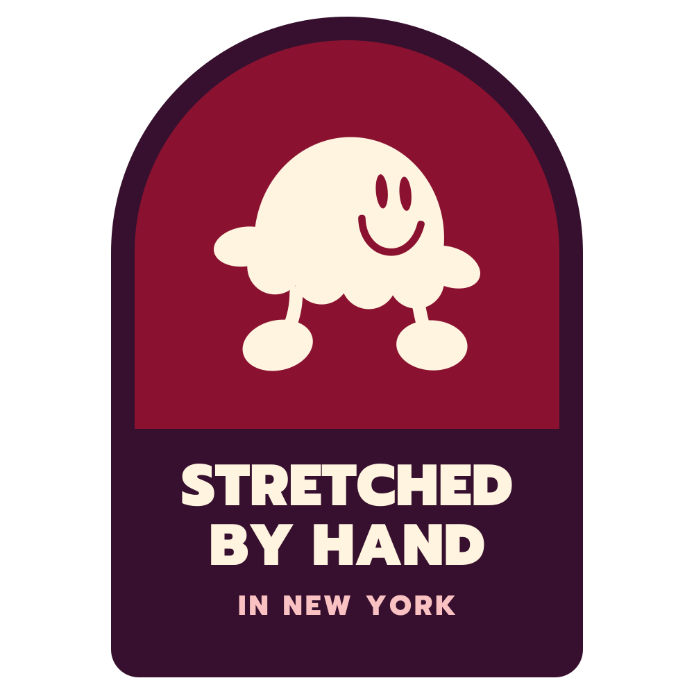

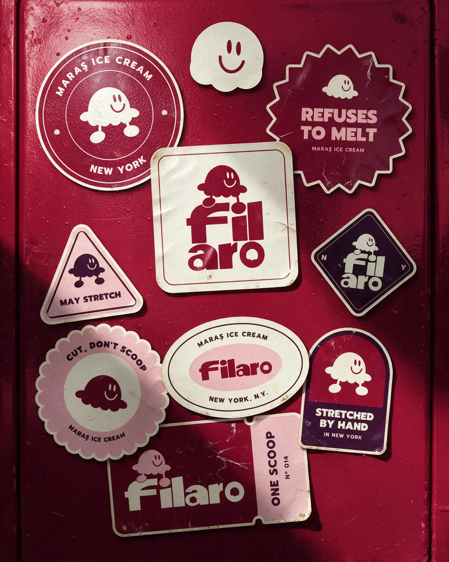
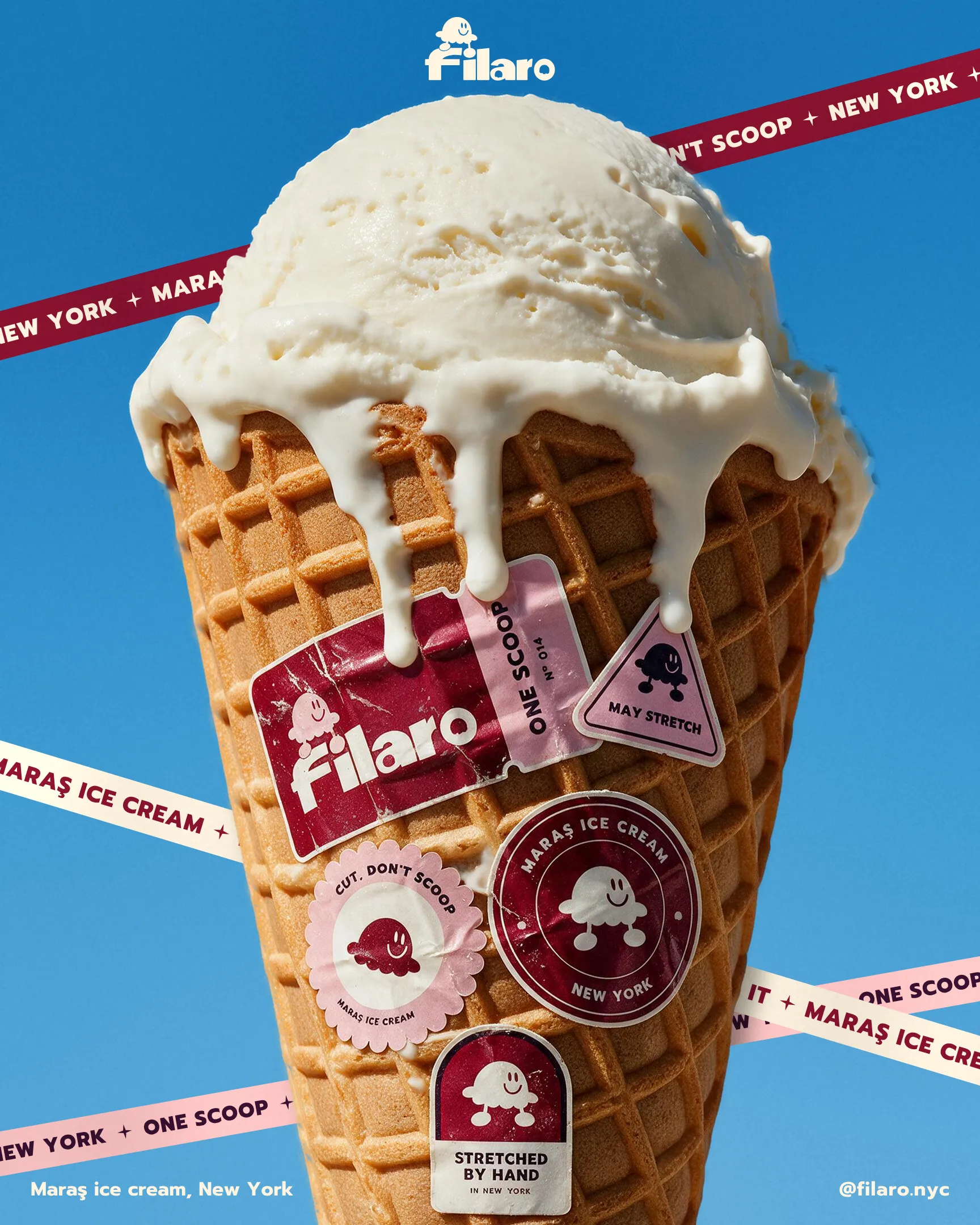
Lids, tickets, carts and freezer doors. Each badge has its own form and color set, and each one says something the brand would say out loud: may stretch, refuses to melt, cut, don't scoop.
Film II · Grid film
Grid lines sweep in, the construction circles draw themselves, then the camera visits the six moves that make the logo work. In the fourth one the figure jumps off the word and the i loses its dot.
Film III · Logo loop
The scoop lifts off and sheds six drops. Each one lands on a letter and runs along it until the letter is full. The last two drops become legs, and the right foot lands as the dot of the i.
Stretch it.
← Back to all workFilaro is a concept brand.Let's talk →